Salt Hour.
Aperitivo, De Pijp.
Concept identity- Brand
- Salt Hour, aperitivo bar (concept)
- Market
- De Pijp, Amsterdam
- Scope
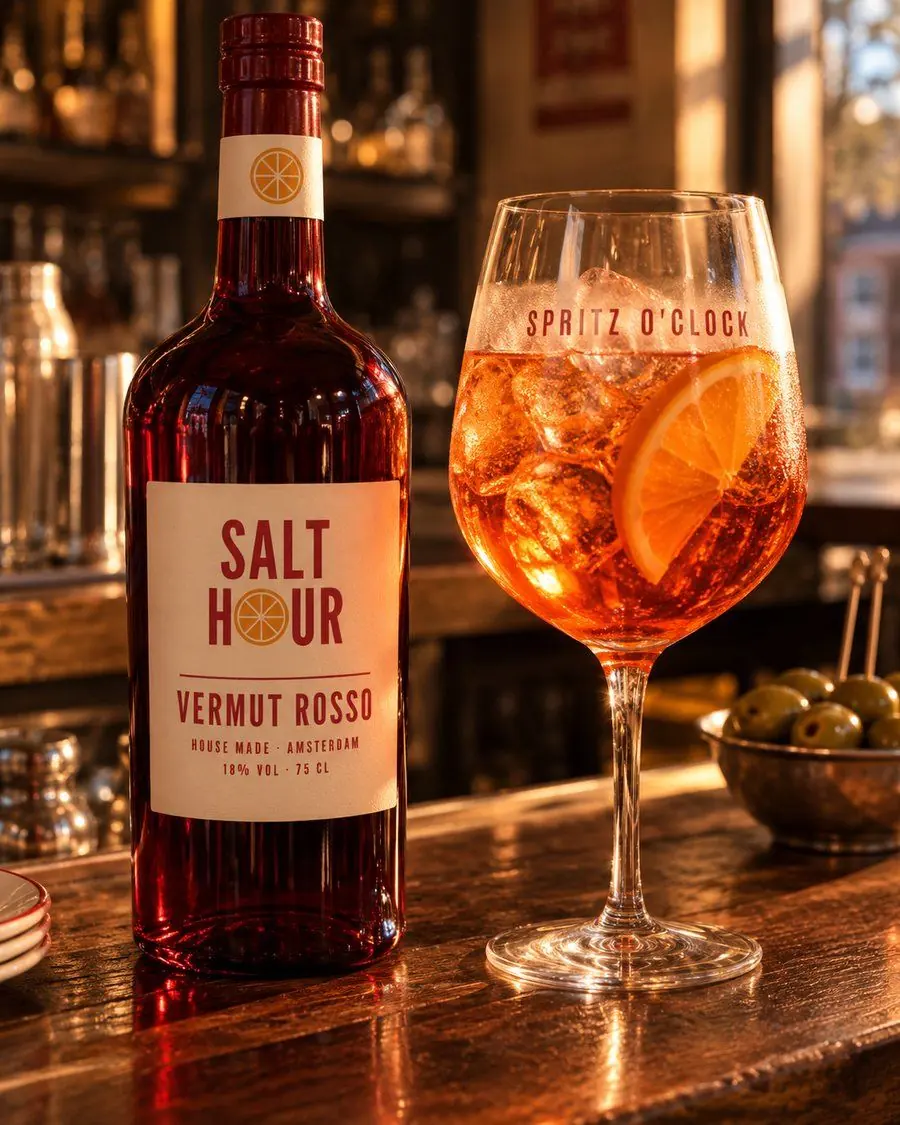
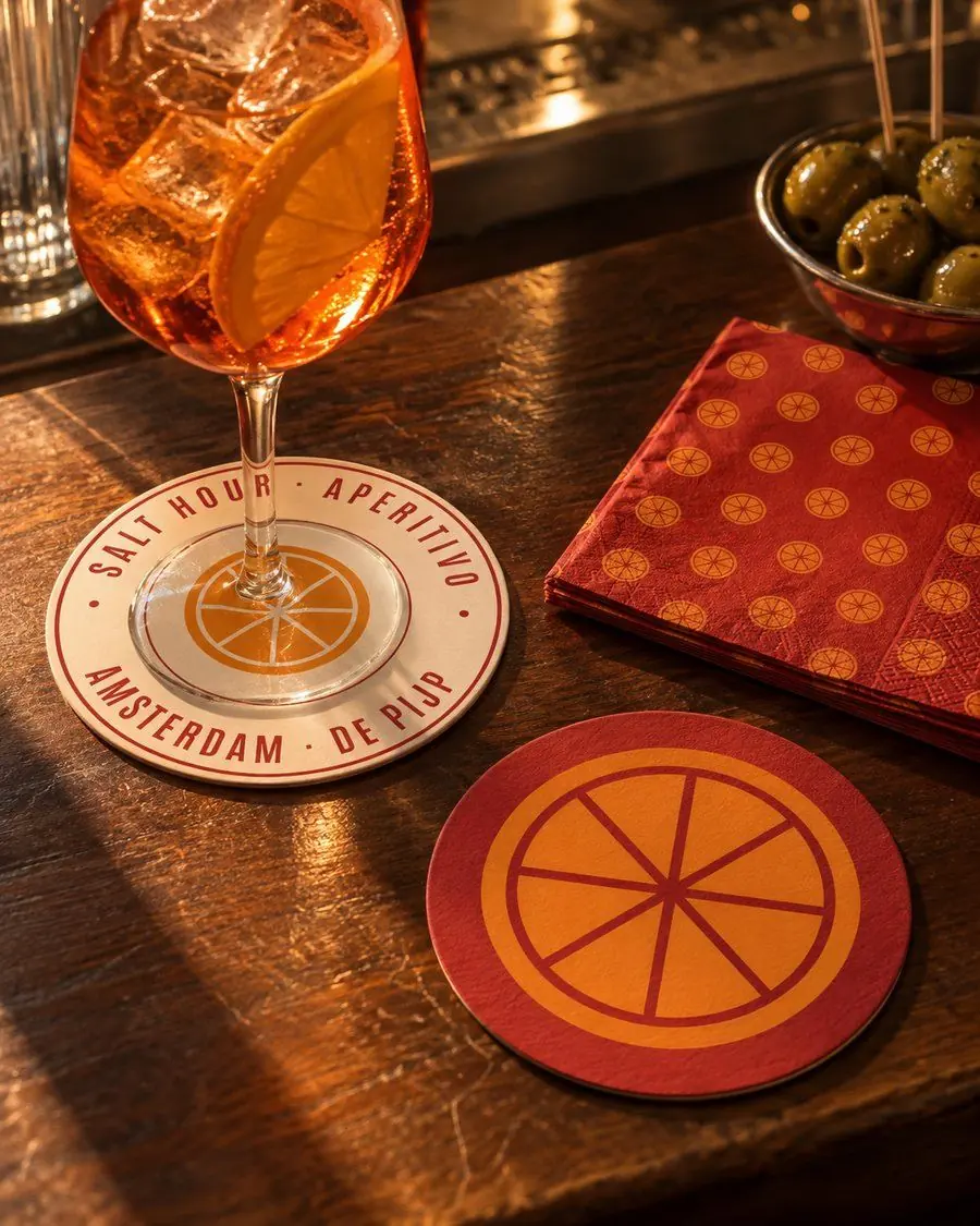
- Identity with a citrus-slice O, posters, bottle labels, coasters
- Files
- Logo set, poster and label artwork, coaster print files
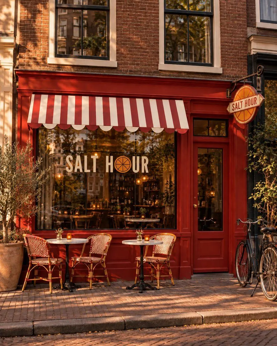
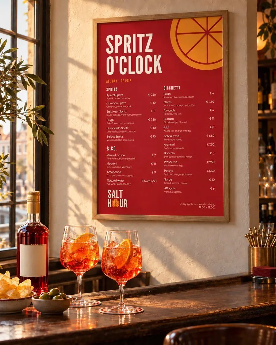
Most bars in Amsterdam lean on one of two looks: brown-café wood and Edison bulbs, or white marble and pink neon. Salt Hour needed to be neither: colourful and cheerful without looking cheap, fed by 1960s Italian bar graphics without turning nostalgic.
Build everything on the colour of 17:00: a red bitter, an orange spritz and a linen tablecloth.
The idea
The hour before dinner, when the light goes orange. The O in the wordmark is a citrus slice, and it turns up everywhere: on the poster, the label and the coaster.
Why it looks like this.
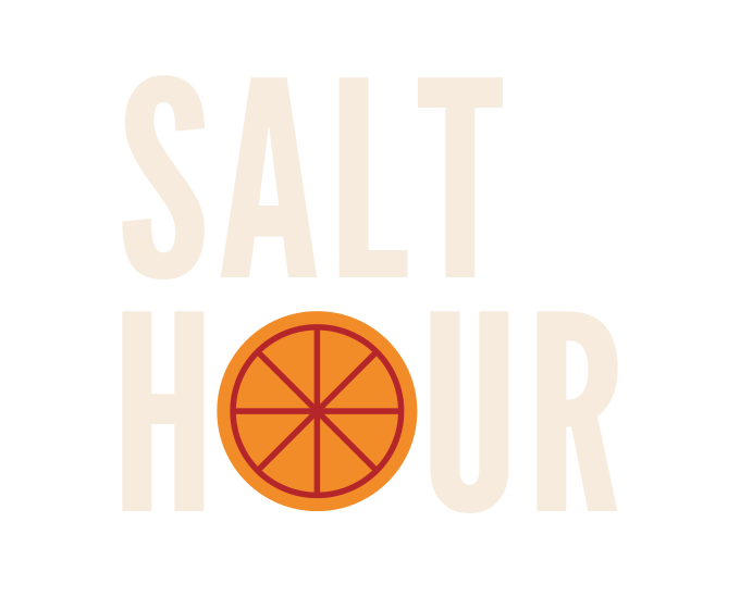
Narrow, tall capitals in two lines. The O in HOUR is an orange slice, the one in the spritz glass, and it is always Spritz orange.
- Campari#B5262B
- Linen#F6EBDD
- Spritz#F28C28
- Bitter#2A1A18
Spritz never becomes a background: only the slice, small accents and one word in a headline.
League Gothic and Antonio for headlines, with the feel of a 1960s poster; Gilroy for menus and prices. No serif on purpose.
Self-initiated concept, not commissioned. Identity, artwork and files designed by Voilà; some scenes are AI-assisted mockups.