FEBO.
Fresh from the wall.
Unofficial rebrand concept- Brand
- FEBO, Dutch kroket automats
- Market
- Amsterdam, the Netherlands
- Scope
- Identity refresh, 10-format campaign, packaging with dielines
- Files
- Print PDFs with bleed and crop marks, digital PNGs, dielines
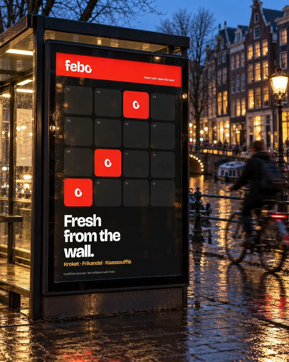
The campaign in its natural habitat: a bus shelter on an Amsterdam canal, a few doors lit, the snack names in mustard yellow.
FEBO owns something no other fast-food brand has: the wall of automat doors. The brief we set ourselves: a campaign that is recognisable before you read a word, and that survives ten formats from a 728×90 banner to a 48-sheet billboard.
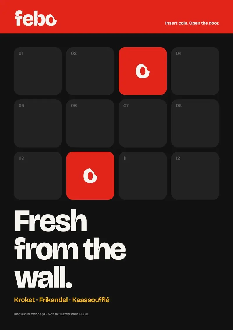
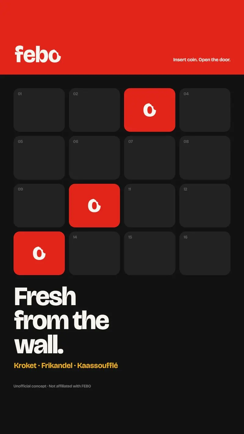
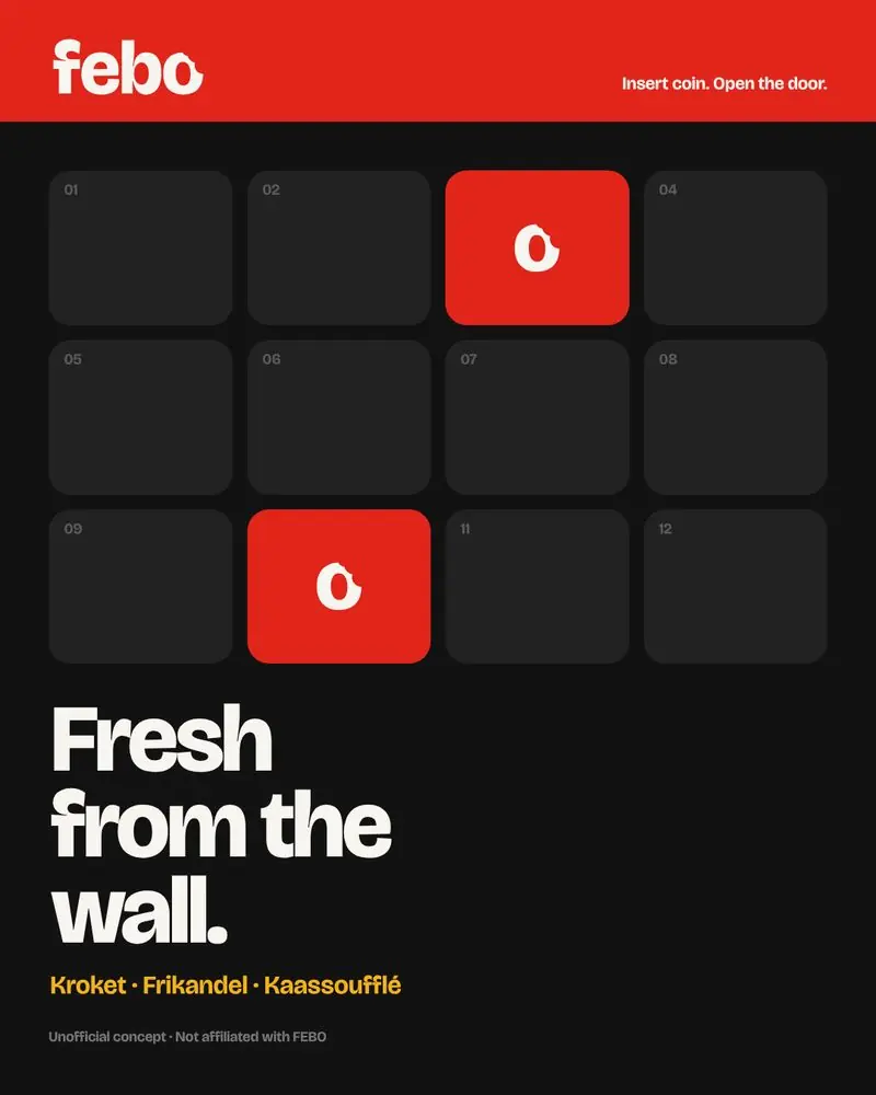
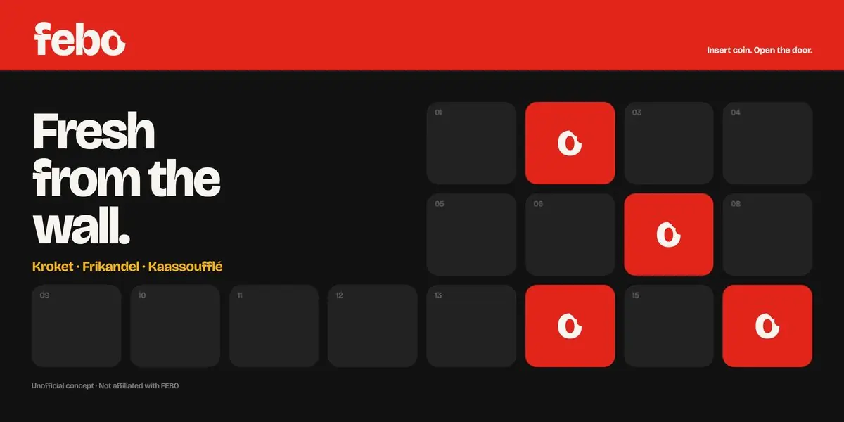
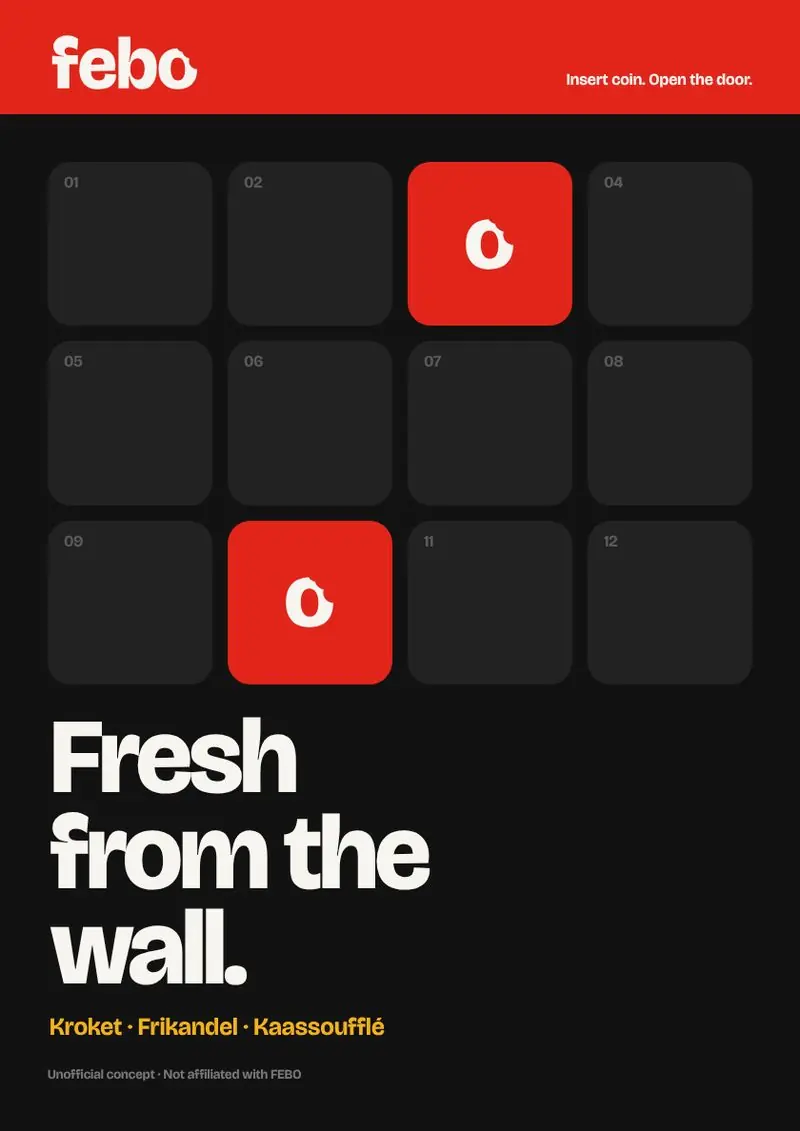
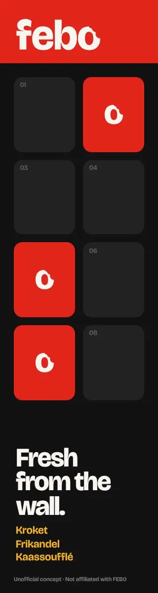
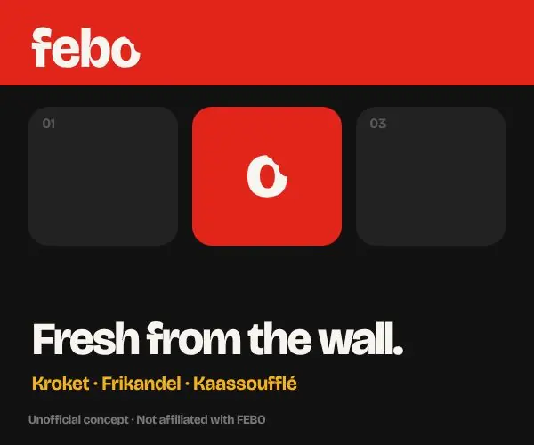
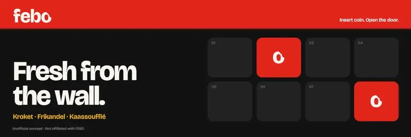
Turn the wall into the layout. One grid of doors, a few lit, a red bar on top. The grid stretches per format; the rules stay the same.
The idea
FEBO already owns the most recognisable wall in Dutch fast food: rows of small automat doors, each with a snack behind the glass.
So the campaign is the wall. A grid of doors where a few are lit, the same at every size. Nobody needs to read the logo to know who it is.
One rule set,
ten formats.
The system is a set of rules, not a single poster:
- 01Red top bar with the logo
- 02The door grid changes columns and rows per format
- 03The headline sits inside the grid, two cells tall
- 04One to four lit doors per layout

Why it looks like this.

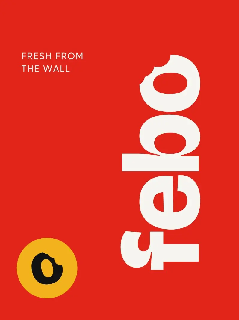
A heavy, rounded lowercase wordmark. A bite is taken out of the o: the snack, not the letter, is the hero.
- Ketchup#D7261E
- Mayo#FFF1CC
- Mustard#F2B21B
- Kroket#6A3417
The campaign pushes the red to #E1251B so it holds on screens and at night.
Headlines in Bricolage Grotesque, condensed and loud, so a two-word line still reads from across the street.
Packaging,
ready to print.
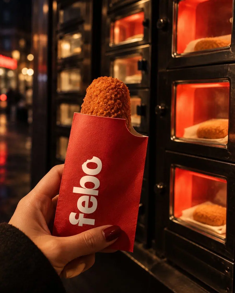
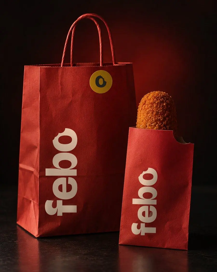
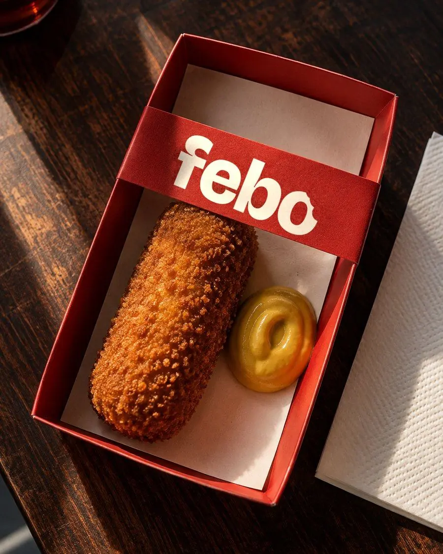
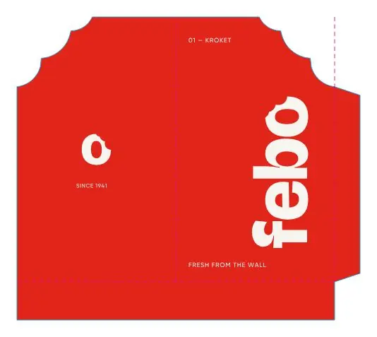
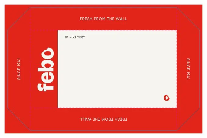
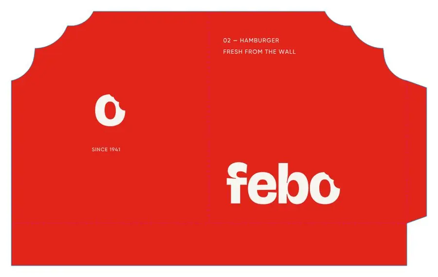
The same red, the same bite. Kroket bag, burger bag, tray and carrier bag, each delivered as a flat dieline with separate print, cut and fold layers.
Unofficial concept. FEBO is not a client and did not commission or endorse this work. Identity, artwork and production files designed by Voilà; street and product scenes are AI-assisted mockups.